Summary
- Company: MIM Software
- In Collaboration With: Engineering, Marketing
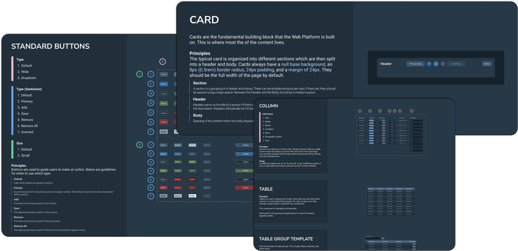
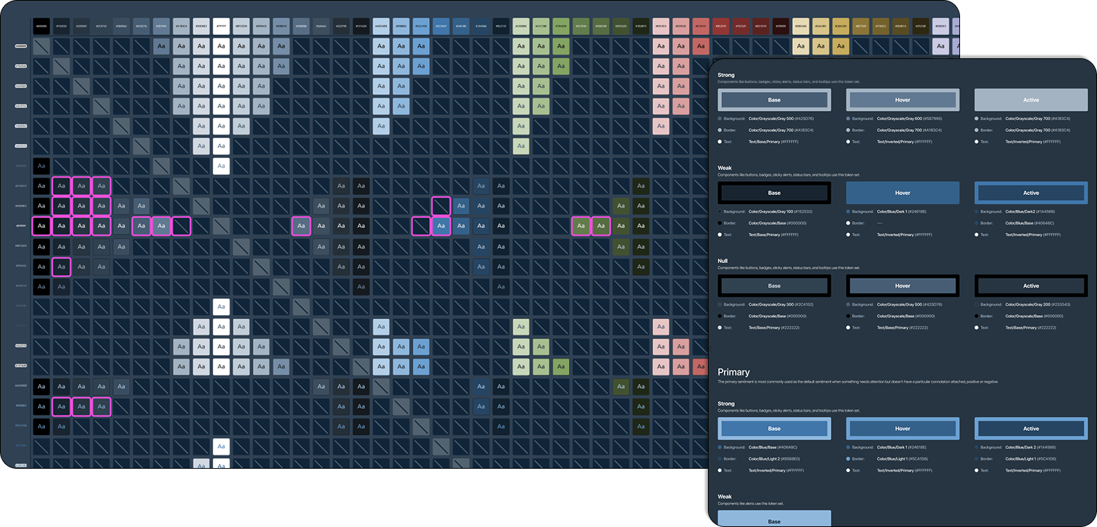
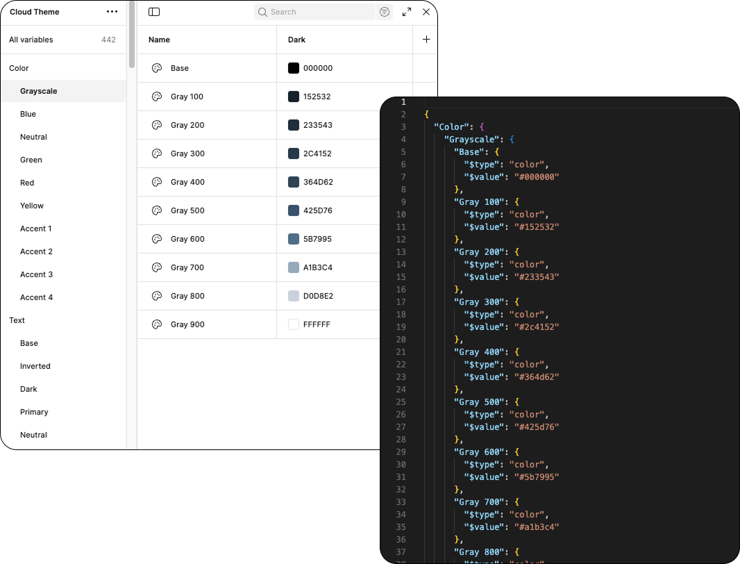
- Tools: Figma Design Systems and Plugins
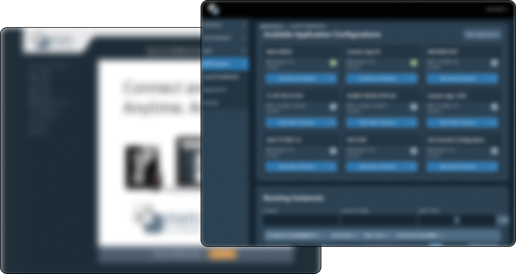
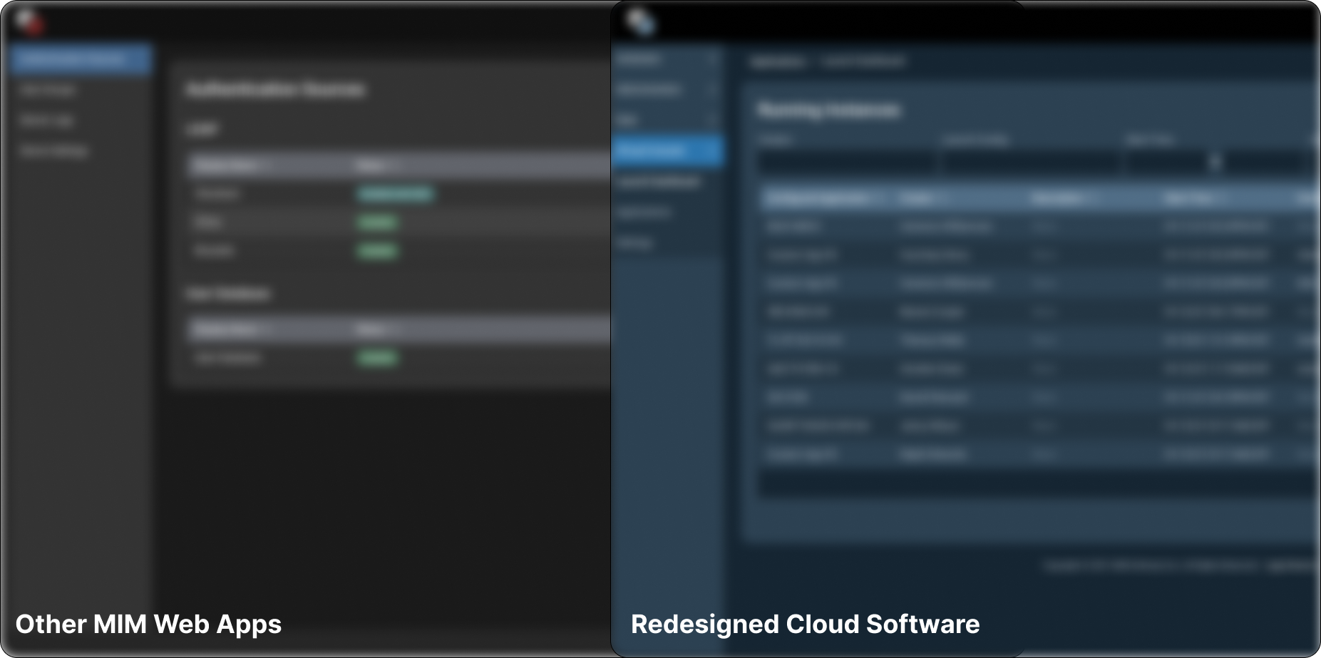
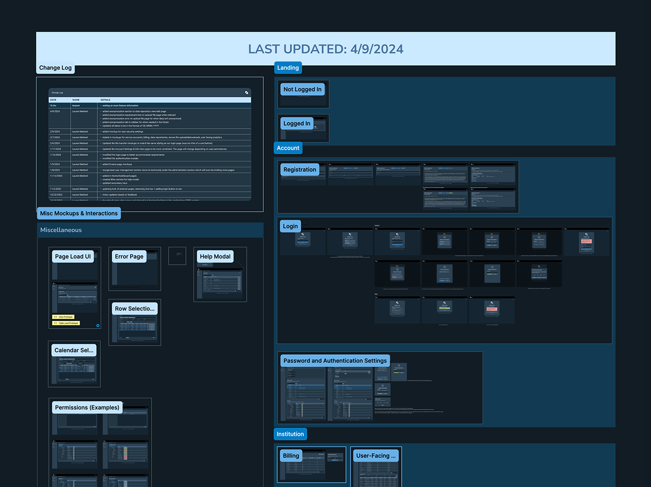
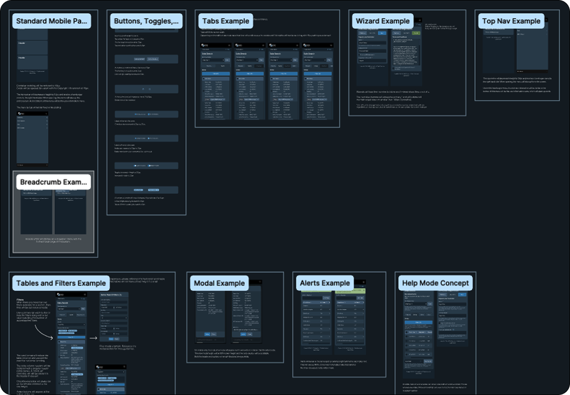
- The Problem: A Cloud product owned by MIM was extremely outdated. The original product was built before there was a design team and had a lot of inconsistent UI that made it difficult for customers to pick up easily. This hurt the business because it was not selling as well as expected, despite the demand for the features of this product.
- The Goal: Redesign the Cloud product to be consistent with other MIM web apps and create in order to improve the user experience and increase overall appeal.