Universal Design System | Lauren Medved

Universal Design System

Introduction

  • Company: MIM Software

  • In Collaboration With: Zach James (UI/UX Designer), Divya Thomas (UI/UX Designer)

  • Tools: Figma Variables and Components

  • The Problem: My team at MIM was facing problems with inconsistency between each of our files and design systems. This made things difficult to maintain and tough to communicate team standards.

  • The Goal: Create a Design System of Design Systems that would provide the building blocks for every file and individual product design system that my team at MIM would make from here on out.

Highlighted Skills

Figma System Design

Visual Design

Team Collaboration

Why We Needed This

When I started at MIM there was a universal design system in place, but it didn’t seem to be well defined. It was also extremely bare bones as far as aesthetics go, which made it less pleasant to use. No one really felt excited to use it, and so most people didn’t unless they absolutely had to. As time went on this became an increasing problem since files were becoming inconsistent and the organization of their contents were often not polished. We also needed to make a new design system for a specific product with extremely complex features. We knew that a solid universal system needed to be in place before beginning that work or else it would become difficult to maintain.

The Research

Before redesigning our existing system we decided to search for inspiration from other successful design systems. I took the time to look at hundreds of systems that were published on the Figma Community or were showcased from large companies. I gathered a variety of things that I liked and didn’t like from these systems and then met with my team to discuss what our system should include. My team shared their thoughts on what they enjoyed from other design systems and we came to an agreement on what ours should include.

Choosing a Theme

Everyone on the team took a stab at designing the overall aesthetic for this new design system. My initial inspiration came from the color palettes and illustrations our marketing team uses. I enjoyed the light colors and wanted to focus on this design system feeling refreshing and playful. I knew our struggle with our previous system was due to the lack of personality and brand that it had. I wanted to focus on making something that made each designer feel happy to use. I also wanted to make sure this system could accommodate projects that had different themes. One struggle we had with creating dark theme components in our current system was that they were extremely difficult to see when our system only had a light theme (white text won't show on a white background). By accomodating different themes, we'll be able to build out components for any of our products in the correct environement.

The System

Components

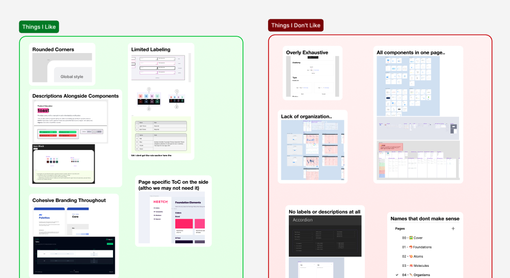
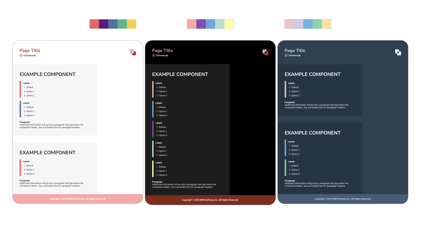
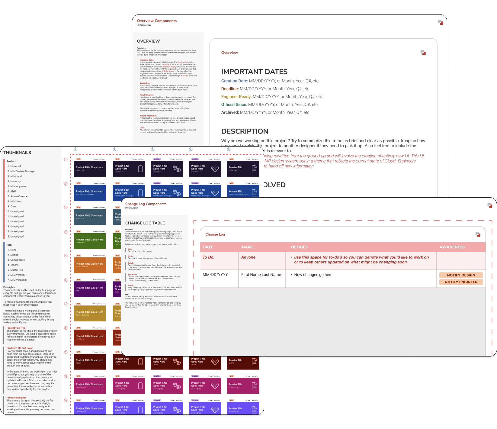
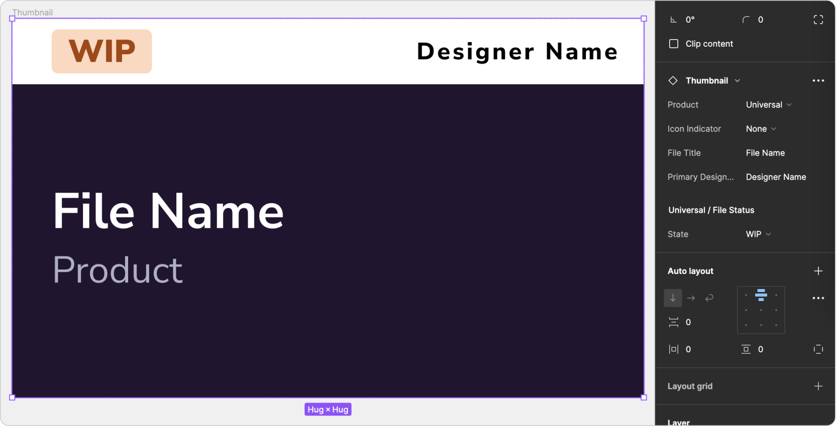
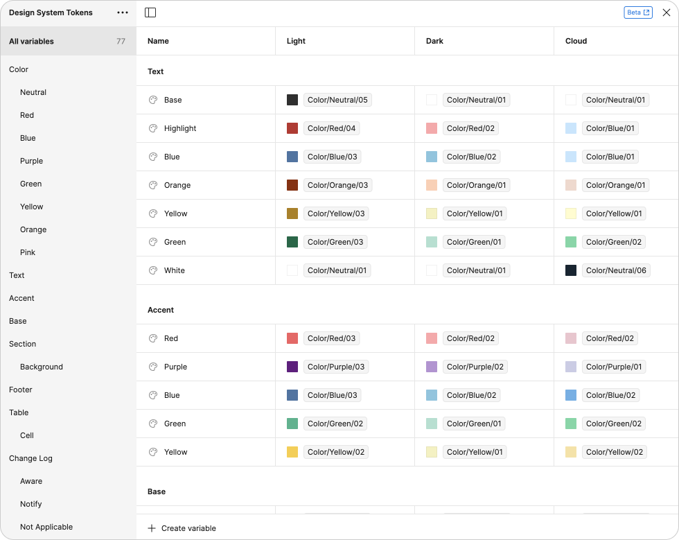
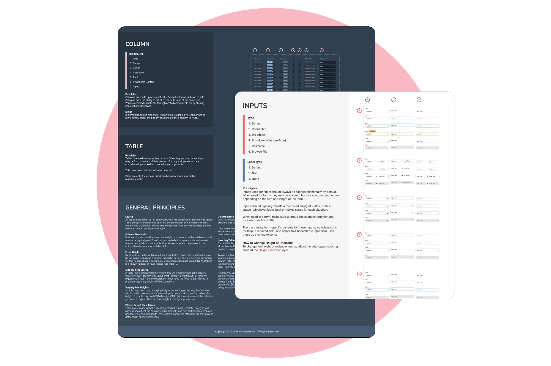
Once we had the aesthetics and theme settled, it was time to begin making the design system components. This comprised of templates for pages, documentation, change logs, thumbnails, labels, and more. Since the team liked my design aesthetic the most, we moved forward with it and I was the primary designer for creating the individual components. While designing each component, it was important for me to consider how the other designers would use them and in what context. You can read more detail about specific components such as Thumbnails and Overview Templates in my Design Organization Process case study.

I wanted to make sure this system would be easy to maintain and update, so I took advantage of Figma's nested components in order to abstract out different pieces. Below is an example of how I did this with our thumbnail componenet. I made our File Status a separate component that we could add to or change indepedent of the thumbnail. This will be useful if we ever determine the need to change our statuses in the future. With Figma's nested components, I was able to make it so that you can edit the file status while you're selecting the thumbnail as whole. This makes this component easy to use and easy to maintain.

Color Tokens

In order to make this system easy to scale for multiple color themes, I created Figma Variables to hold our color tokens. Using Variable Modes makes it easy for us to set the theme of the design sytem when we make a new file using it. Additionally, using variables makes this system easy to maintain and update.

Outcomes

After implementing this new design system, our file workflow has improved significantly within Figma. We converted all of our existing product design systems to using this as the base system and have created file templates using my components as well. Overall, the feedback I recieved on this design system has been positive and it's helped my team make their files more polished and consistent. Additionally, this system has served as a solid foundation for the new design system we are creating for a complex product. It has allowed us to start developing this system with good organization and provided intentional spaces for documentation.

Want to See More?